Let optic white and soft ivory play different roles
Two pale garments can look intentional together even when their whites differ. The useful decision is whether you want a quiet variation or a visible contrast. This exercise treats the garments as actual surfaces under your own light, rather than assuming a color name guarantees a match.
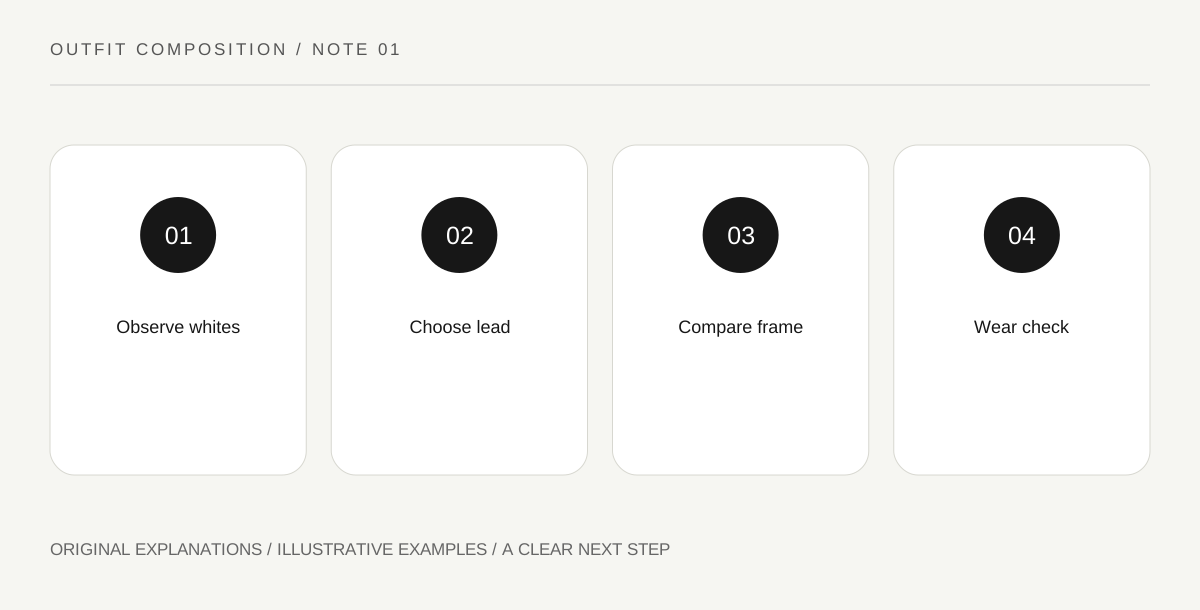
Original explanatory diagram. Read the full method and limitations below.
Compare the whites side by side
Place the two pieces together near ordinary daylight and again under the light where you expect to wear them. Name what you see: a bright white, a creamy ivory, a slightly gray white. These descriptions are observations rather than a technical color analysis. A phone photograph may alter the relationship, so use it as a note rather than the final authority on how the clothes appear to your eyes.
Choose which pale surface leads
A large ivory knit beside a small bright-white collar creates a different composition from bright-white trousers beneath a narrow ivory top. The larger area may establish the overall mood while the smaller one reads as a detail. You do not need to make the colors look accidentally identical. Give each a clear role, then decide whether the difference feels like a pleasing variation or a distraction from the outfit you wanted.
Introduce a third value deliberately
A dark shoe or jacket can frame the pale surfaces and make their difference less isolated. A midtone companion may produce a softer overall transition. Try one version with a dark edge and one without it, using garments already available. The experiment concerns the relationship between light and dark areas, not a rule that every pale outfit needs black accessories or that ivory belongs to a particular season.
Check opacity and contact in use
A pale outfit should work while sitting, walking and carrying the bag you actually need. Look at the complete combination in ordinary conditions and choose underlayers according to your own comfort and coverage preferences. Check whether a dark accessory rubs against a delicate pale surface. If care information or color transfer is uncertain, seek the maker’s guidance before assuming the visual combination is practical for a long day.
Illustrative worked example
Illustrative combination: A reader pairs ivory wide trousers with a bright-white cotton top. She first tries pale shoes, producing a continuous light field. She then adds a charcoal jacket, which frames the difference between the whites. She prefers the second version for an evening indoors but keeps the first as another option. Her note reads: ivory is the large base; white is the crisper upper detail; charcoal supplies the frame.
Questions that come up
Must ivory and white match exactly?
No. An intentional difference can be part of the composition. The useful question is whether you enjoy the visible relationship in the complete outfit.
Does this require buying a third color?
No. Test an existing jacket or shoe first. You may decide that the two pale surfaces already create the effect you want without another purchase.
References and scope
These sources support the factual background. Examples and exercises are original illustrative teaching material. References do not imply endorsement.
- V&A Fashion collection — Primary visual references for examining silhouette, construction and decorative relationships; the styling exercises here are original.
- FTC Clothes Captioning — Garment care instructions and the importance of reading the complete care label.