Compose color blocks by area rather than counting colors
A color-blocked outfit can use only a few colors and still have a complex arrangement. The size and placement of each area matter as much as the names of the colors. This exercise compares large fields, small accents and the boundaries between them.
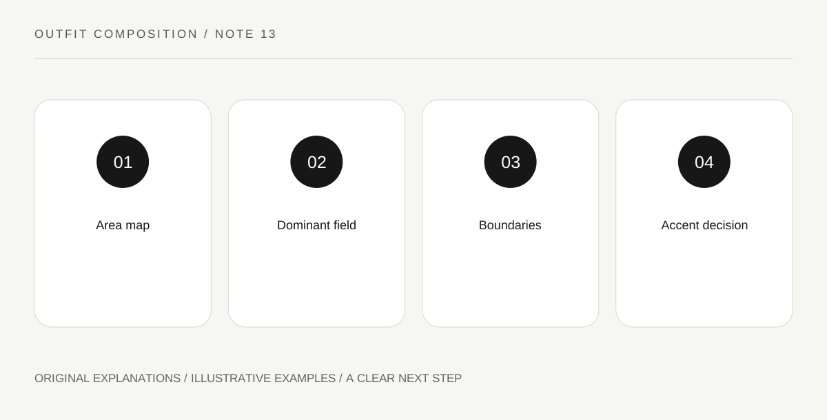
Original explanatory diagram. Read the full method and limitations below.
Sketch the outfit as simple areas
Draw a rough front view using rectangles or broad shapes for the top, lower garment and outer layer. Fill them with approximate colors. The sketch need not resemble your body or become an illustration project. It is a map of visible areas. A small bright cuff and a large bright trouser leg occupy different amounts of the outfit even if both count as one color in a verbal list.
Choose a dominant field
Decide which area should set the first impression. A large dark lower half can support a bright upper block, while a colored coat can surround a quieter center. These are compositional options rather than laws about what colors suit particular people. Try the actual garments after sketching, because fabric movement and openings can change the visible amount. A coat worn open may show less of its own color than the flat sketch suggests.
Study the boundaries between blocks
A crisp horizontal hem creates a different division from an open jacket’s vertical edges. A patterned or textured piece can make the boundary less simple. Notice where colors meet rather than only whether they belong to a familiar palette. If you want a clearer graphic effect, choose an existing garment with a definite edge. If you prefer a softer transition, a draped layer may create the relationship you enjoy.
Use an accent only if it adds something
A small contrasting shoe, earring or bag detail can repeat one color or introduce another. Compare the outfit before and after adding it. More colors do not automatically mean more creativity, and fewer do not automatically mean more refinement. The useful choice is whether the accent changes the composition in a way you want. Record its area and position, not merely a list of colors to replicate in another outfit.
Illustrative worked example
Illustrative sketch: A reader maps cobalt trousers as a large lower block, an ivory top as the center and a dark open jacket as two side frames. She first adds a red bag, then compares the outfit without it. She prefers the quieter version because the cobalt already carries the main emphasis. Her note records the large lower field and dark vertical boundaries, which helps her adapt the idea with different garments later.
Questions that come up
Is there a correct number of colors?
No universal count determines whether a composition works for your taste. Area, contrast, texture and placement all affect the result.
Must colors be equally distributed?
No. Unequal areas can be deliberate. A small accent and a large field can play different roles while using the same hue.
References and scope
These sources support the factual background. Examples and exercises are original illustrative teaching material. References do not imply endorsement.
- V&A Fashion collection — Primary visual references for examining silhouette, construction and decorative relationships; the styling exercises here are original.
- V&A Introduction to 1960s fashion — Museum context for distinct silhouettes and the importance of viewing garments as complete designs.